Thursday, July 28, 2011

Why do invites have inner envelopes?

First let me start by saying, this is the most commonly asked question by ALL of my Brides and Grooms when it comes to the details of their invitation. Each time I explain why there is a need for an inner envelope, but also keep in mind... it's a new era and people do what they want, not everyone feels it's necessary to have an inner envelope. With that said, I, however, follow the rules of Emily Post Wedding Etiquette, and she says just this:

The inner envelope has the title and last names of the Guest(s) receiving the invite and nothing more, no address on this envelope. This also allows the host to specify who is invited and who is NOT invited. It is also ok to write familiar names here like; Nana and PopPop or Uncle James and Aunt Jean. If you are only inviting adults then the inner envelope would look like this:

Mr. and Mrs. Oliver Smith

If you are inviting their children along with the parents, the inner envelope would read:

Mr. and Mrs. Oliver Smith
Jennifer Smith
Brian Smith

The inner envelope is another place for where to write "and Guest". If you are guesting someone with their invite, it's always nice to include the Guests' name if you know it, but if not "Guest" is fine. It is not appropriate to write "and Guest" on the OUTER envelope, which is reserved for addressing purposes, hence the inner envelope.

Last but not least, this allows you another area of your invite to color coordinate with your wedding theme by lining the inner envelope with a color of your choice! You're wedding invite is once in a lifetime... go all out!


Saturday, June 25, 2011

Jamie & Ben - 03.25.11

Jamie and Ben came to me with a mutual love of things black, white and green... and of course damask! This time around I was going for something completely different than my "claim to fame" damask design. We wanted to step outside of the box and we did just that! This was kind of couple that wanted a fun, mod, and colorful design. I couldn't think of any better words that best describe them as a couple either, fun, mod and colorful.

The invite: This was the inspiration of the entire suite and set the tone from the get-go.


The next suite to design was the Day of Suite... all things needed for the day of the wedding. My personal favorite was the program, 3 pages strung together with matching ribbon and delicately hung on every other chair for the ceremony. Love! The Day of Suite consisted of: Welcome Bag Tags, Programs, Table Number Signs, and Jamie and Ben's ultra-fun creation... the escort cards! (Pictures of the programs, table numbers and escort cards were taken by Stevie T Photography)


Here's the happy couple! It was a pleasure working with them and I wish them nothing but the best going forward in their new life together! 

Tuesday, June 21, 2011

Belly Bands

Belly bands are used to enclose all of your invitation contents within the envelope. It's a decorative strip of paper, most of the time with your monogram or names printed on the front, bound around the invite and accessory cards by a little glue dot or strip of double sided adhesive in the back. Not only does it look beautiful, but it also doubles as a simple way to keep all of those little cards safe, sound and together inside. See below.... love it, right!?!


Wednesday, June 8, 2011

Envelope Garnish!

You've spent the time perfecting the invite, the respond card, the accommodations card, etc... now that the inside contents are taken care of, don't forget about the last piece to your ensemble... the envelope! The outside of the envelope is the very FIRST thing your guests will see as a part of your special event. Don't just slap an Avery laser-jet label with your return address printed slightly crooked onto your masterpiece! Take the extra step to wrap up your invite with a pretty little bow.

Below are some ideas of how to add that extra garnish to your invite, super cute huh!?

Return Address Printing: Coordinating fonts and inks stay with the theme of your invite and looks effortless. My personal favorite is to add a motif or monogram on the flap.
Envelope Icing: Truly the icing on the proverbial cake! This new twist on an address label also doubles as a guest address label for the front. Either have these addressed by a calligrapher or pre-printed digitally during the production process of the label itself.
The last idea is the most common but still adorable. Envelope seals: This literally seals your envelope with an adhesive label. Have a monogram or a cute quote printed on it and tada! Your envelope is officially garnished.

Thursday, March 31, 2011

A New Twist On Breakfast In Bed

Ever attend a wedding where they also host a morning after brunch for all of their guests to enjoy that stayed overnight? Think to yourself "this is so nice, maybe someday for my wedding I can do this!".... and then your very own wedding plans come along and your budget is, well, not as giving?!? Check this adorable and scrumptious idea out and you may have found a yummy alternative!

Arrange with your hotel concierge/manager to hand deliver these fantastic little baskets to your guests' rooms the morning after your big day. Fill them with mini corn muffins and miniature jams, lined with your choice of napkin with a little favor tag designed by JW Impressions, of course :) This thoughtful morning after arrival will leave your guests with nothing but a sweet taste in their mouth and it didn't compromise your "creative budget" at all! Once again, I wish I did this at my own wedding!

Tuesday, March 22, 2011

Hand Cancelled Invitations

For those of you who are new to this stationery thing, here is your little "learn something new everyday" moment. Hand cancelling an invitation is simply when the post office hand stamps each envelope with a post mark instead of running it through a machine which does this automatically. Why do this you ask? Well, there are several reasons... First a foremost it is an added personal touch for your special event, you put so much tought into the contents inside the envelope why stop there?! A more practical reason is because this takes away the possibility of one of the invites getting ruined running through the machine, which if your invite is overly thick it may have to be hand cancelled anyway. Lastly it eliminates all of the other "not so elegant" marks the postal machine puts all over your envelope.

Yes, I have heard that some post offices may refuse to hand cancel invites upon request, but I have also heard that if you go into your local post office at a slower time that you should have no problem. I'd say it is certainly worth a try, think how they will look to your guests when they receive it in the mail. Just another special added touch that will remind them how lovely and elegant your wedding was or is going to be!

Monday, March 21, 2011

New Favor Alert: Personalized Note Card Sets

I saw this idea in Martha Stewart Weddings magazine and had to share it with you all! A stationery lovers perfect favor, personalized note card sets for each guest attending your wedding. Put these note cards at each place setting acting as both place card and favor (I would recommend still having escort cards to escort the guests to the appropriate table). Each correspondence card is 4" by 5.5" in size, using your choice of color for the cardstock and coordinating envelope. Simply tie each bunch, 8 per set, using ribbon, raffia, or twine and tada! My personal idea is to add your personalized wedding monogram on the back of each card for extra wedding flare.

Tuesday, March 1, 2011

Can't go wrong with black and white!

I admire nothing more then a timeless, classic, and elegant look for pretty much anything... especially for weddings! I wanted to showcase some of my favorite black and white pieces of wedding stationery that will never get old or go out of style! For more info on the below ensembles, please contact JW Impressions.


Presidio- by Checkerboard
Formal elegance with a contemporary twist! A play on the traditional black-on-cream wedding invitation, this dressy and oh-so-stylish collection features a dramatic jet invitation with silver print and a Geneva die- cut back pocket to hold your accessories. The central motif is your initials, encircled within a classic double seal that is playfully repeated on many of the accessories. Cream and jet accents complement one another throughout the collection, highlighted by accents of silver.
Seascape- by Checkerboard
Classic black-on-white beauty with exquisite texture! Your extra-heavy cardstock invitation in gleaming white is beautifully embossed on front and back with intricate ripples overlaid with a very subtle diamond pattern, evoking a swiftly flowing current or lapping ocean waves. The print block follows the slant of the ripples, taking your invitation out of the realm of the traditional and into ultra-modern! And just for fun, formal all-capital typeface alternates with all lower-case script to announce your special day.
Attune- by Checkerboard
Just exquisite!! 
J'Adore- by Checkerboard
With clean vertical lines and classic black and cream colors, this invitation is perfect for a truly tasteful wedding celebration. The embossed scroll design and luxurious black ribbon carefully tie the invitation together.
Black and white are combined to form this striking pocket invitation. The bright white card will feature all of your wording with an elegant, filigree design sweeping across the top. Coordinating respond and reception cards will feature a similar design.
This white card invitation features a black and white embossed floral design on the top and bottom that borders the wording of your choice.
Black background with a white damask design on the top and bottom.
This elegant invitations models an exquisite black damask on an ecru background.

Friday, January 28, 2011

Eileen & Howard - 11.20.10

This couple has a very special part of JW Impression's heart... they were my very first wedding from start to finish that I was ever given the chance to do besides my own! Eileen and Howard came to me in August of 2009 when things were just starting to get serious with JW Impressions, I was exstatic to say the least to work with them on their wedding stationery.

Through the months and well a little over a year we, together, built this classic and elegant design. Eileen was the kind of Bride that loved endless amount of options and was very involved with every little detail down to the the specific color for the purple backer cards used. She would always tell me how excited she would get when she would see my name in her inbox with an attachment in the email.

We ultimately settled in on a timeless with a twist look using crystal shimmer paper, deep purple and a rich olive green ink, and a monogram that would be used throughout the entire suite. She wanted the crystal shimmer paper to speak for itself, which I personally believe it did!

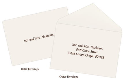
This was the invitation and respond card I designed, using the same concept as stated above. The ink is a raised thermography print.
For the Day Of Suite, we kept with the theme and used a flat printing method. Photos courtesy of Lauren Pupillo Photography, whom did a phenomenal job capturing Eileen and Howard's special day!

The program: I placed their monogram with a brief introduction to the ceremony on the top/front of the sheet. Eileen was not a fan of folded or "fan" shaped programs, and especially did not like extremely tall or wide shapes either. We ended up working with this 8.5" X 5.5" sized card which was perfect! This program was double sided with print, the ceremony on the front and bridal party of the reverse with a heartfelt thank you from the happy couple.

Seating Chart: This was an oversized flat print, 18" X 24" to be exact placed in a beautiful brushed bronze frame that was stationed at the welcome table for guests to be greeted with after the ceremony.

Card Box Sign: This sign was specifically created to help guide the guests as to where they should place their cards that they brought for the Bride and Groom. Eileen thought of using this antique bird cage as the "container" for the cards, which I adored by the way! (If you look above in the previous photo you will see a little framed sign on the bottom right of the image, this was the "Signature Frame" sign we created to help instruct the guests to sign their names on a white thick matted frame that held a picture from their engagement shoot. The couple wanted to have this keepsake for the years to come and be able to see all of the signatures from their friends and family that attended their wedding.

This next grouping of pictures is what the guests were greeting with as they arrived to their table. Beautiful right! Each place setting had a delicious and humongous green apple covered in caramel, and drizzeled chocolate. I was so surprised when one of these caramel covered balls of perfection arrived at my doorstep the very next day after the wedding... and believe me, it was amazing! I created the favor tag that was tied onto the top of the apple with coordinating green or purple sheer organza ribbon. The table number tents/signs were purple tented cards with their monogramed design printed on crystal shimmer paper attached on both sides.
All in all, it was a fabulous and esquisite project to work on and I am very thankful to have been a part of it. Congratulations Eileen and Howard, now let's get started on designing your BABY stationery! (Thank you again Lauren Pupillo Photography for your awesome work!)