

Monday, March 21, 2011
New Favor Alert: Personalized Note Card Sets
I saw this idea in Martha Stewart Weddings magazine and had to share it with you all! A stationery lovers perfect favor, personalized note card sets for each guest attending your wedding. Put these note cards at each place setting acting as both place card and favor (I would recommend still having escort cards to escort the guests to the appropriate table). Each correspondence card is 4" by 5.5" in size, using your choice of color for the cardstock and coordinating envelope. Simply tie each bunch, 8 per set, using ribbon, raffia, or twine and tada! My personal idea is to add your personalized wedding monogram on the back of each card for extra wedding flare.

Tuesday, March 1, 2011
Can't go wrong with black and white!
I admire nothing more then a timeless, classic, and elegant look for pretty much anything... especially for weddings! I wanted to showcase some of my favorite black and white pieces of wedding stationery that will never get old or go out of style! For more info on the below ensembles, please contact JW Impressions.
Presidio- by Checkerboard
Formal elegance with a contemporary twist! A play on the traditional black-on-cream wedding invitation, this dressy and oh-so-stylish collection features a dramatic jet invitation with silver print and a Geneva die- cut back pocket to hold your accessories. The central motif is your initials, encircled within a classic double seal that is playfully repeated on many of the accessories. Cream and jet accents complement one another throughout the collection, highlighted by accents of silver.


Presidio- by Checkerboard
Formal elegance with a contemporary twist! A play on the traditional black-on-cream wedding invitation, this dressy and oh-so-stylish collection features a dramatic jet invitation with silver print and a Geneva die- cut back pocket to hold your accessories. The central motif is your initials, encircled within a classic double seal that is playfully repeated on many of the accessories. Cream and jet accents complement one another throughout the collection, highlighted by accents of silver.

Seascape- by Checkerboard
Classic black-on-white beauty with exquisite texture! Your extra-heavy cardstock invitation in gleaming white is beautifully embossed on front and back with intricate ripples overlaid with a very subtle diamond pattern, evoking a swiftly flowing current or lapping ocean waves. The print block follows the slant of the ripples, taking your invitation out of the realm of the traditional and into ultra-modern! And just for fun, formal all-capital typeface alternates with all lower-case script to announce your special day.

Attune- by Checkerboard
Just exquisite!!

J'Adore- by Checkerboard
With clean vertical lines and classic black and cream colors, this invitation is perfect for a truly tasteful wedding celebration. The embossed scroll design and luxurious black ribbon carefully tie the invitation together.

Black and white are combined to form this striking pocket invitation. The bright white card will feature all of your wording with an elegant, filigree design sweeping across the top. Coordinating respond and reception cards will feature a similar design.

This white card invitation features a black and white embossed floral design on the top and bottom that borders the wording of your choice.

Black background with a white damask design on the top and bottom.

This elegant invitations models an exquisite black damask on an ecru background.

Friday, January 28, 2011
Eileen & Howard - 11.20.10
This couple has a very special part of JW Impression's heart... they were my very first wedding from start to finish that I was ever given the chance to do besides my own! Eileen and Howard came to me in August of 2009 when things were just starting to get serious with JW Impressions, I was exstatic to say the least to work with them on their wedding stationery.
Through the months and well a little over a year we, together, built this classic and elegant design. Eileen was the kind of Bride that loved endless amount of options and was very involved with every little detail down to the the specific color for the purple backer cards used. She would always tell me how excited she would get when she would see my name in her inbox with an attachment in the email.
We ultimately settled in on a timeless with a twist look using crystal shimmer paper, deep purple and a rich olive green ink, and a monogram that would be used throughout the entire suite. She wanted the crystal shimmer paper to speak for itself, which I personally believe it did!
This was the invitation and respond card I designed, using the same concept as stated above. The ink is a raised thermography print.

 For the Day Of Suite, we kept with the theme and used a flat printing method. Photos courtesy of Lauren Pupillo Photography, whom did a phenomenal job capturing Eileen and Howard's special day!
The program: I placed their monogram with a brief introduction to the ceremony on the top/front of the sheet. Eileen was not a fan of folded or "fan" shaped programs, and especially did not like extremely tall or wide shapes either. We ended up working with this 8.5" X 5.5" sized card which was perfect! This program was double sided with print, the ceremony on the front and bridal party of the reverse with a heartfelt thank you from the happy couple.


Seating Chart: This was an oversized flat print, 18" X 24" to be exact placed in a beautiful brushed bronze frame that was stationed at the welcome table for guests to be greeted with after the ceremony.




Through the months and well a little over a year we, together, built this classic and elegant design. Eileen was the kind of Bride that loved endless amount of options and was very involved with every little detail down to the the specific color for the purple backer cards used. She would always tell me how excited she would get when she would see my name in her inbox with an attachment in the email.
We ultimately settled in on a timeless with a twist look using crystal shimmer paper, deep purple and a rich olive green ink, and a monogram that would be used throughout the entire suite. She wanted the crystal shimmer paper to speak for itself, which I personally believe it did!
This was the invitation and respond card I designed, using the same concept as stated above. The ink is a raised thermography print.


The program: I placed their monogram with a brief introduction to the ceremony on the top/front of the sheet. Eileen was not a fan of folded or "fan" shaped programs, and especially did not like extremely tall or wide shapes either. We ended up working with this 8.5" X 5.5" sized card which was perfect! This program was double sided with print, the ceremony on the front and bridal party of the reverse with a heartfelt thank you from the happy couple.


Seating Chart: This was an oversized flat print, 18" X 24" to be exact placed in a beautiful brushed bronze frame that was stationed at the welcome table for guests to be greeted with after the ceremony.


Card Box Sign: This sign was specifically created to help guide the guests as to where they should place their cards that they brought for the Bride and Groom. Eileen thought of using this antique bird cage as the "container" for the cards, which I adored by the way! (If you look above in the previous photo you will see a little framed sign on the bottom right of the image, this was the "Signature Frame" sign we created to help instruct the guests to sign their names on a white thick matted frame that held a picture from their engagement shoot. The couple wanted to have this keepsake for the years to come and be able to see all of the signatures from their friends and family that attended their wedding.

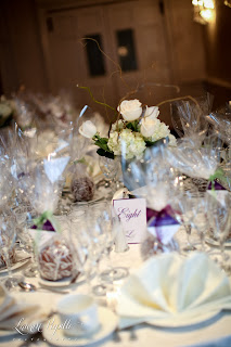
This next grouping of pictures is what the guests were greeting with as they arrived to their table. Beautiful right! Each place setting had a delicious and humongous green apple covered in caramel, and drizzeled chocolate. I was so surprised when one of these caramel covered balls of perfection arrived at my doorstep the very next day after the wedding... and believe me, it was amazing! I created the favor tag that was tied onto the top of the apple with coordinating green or purple sheer organza ribbon. The table number tents/signs were purple tented cards with their monogramed design printed on crystal shimmer paper attached on both sides.


All in all, it was a fabulous and esquisite project to work on and I am very thankful to have been a part of it. Congratulations Eileen and Howard, now let's get started on designing your BABY stationery! (Thank you again Lauren Pupillo Photography for your awesome work!)

Tuesday, January 18, 2011
Valentine's Day Cards!
Valentine's Day is here! These card and sticker sets are perfect for your special sweetie and make perfect Valentines for your kids' friends and school parties! Grab some of these cute combos today and LOVE giving them this season! Find these below and more at my Paper Concierge site. 'Tis the season for L-O-V-E!


Checkerboard Invitations and Announcements
JW Impressions is excited to announce the newest addition to our exclusive lines list... Checkerboard!!! This stationery house offers something for everyone and has been a line I have been admiring for quite some time. I am thrilled to show all of my Brides what they have to offer and couldn't be happier that I am a part of the Checkerboard team! It's not just wedding invites either, they have all aspects of social stationery from Baby to Bar & Bat Mitzvah. Check back for more details for e-commerce services, or contact us to set up an appointment to view their albums in person!


Friday, December 17, 2010
Jessican & Chad - 9.25.10
I had the pleasure of working with this adorable couple, Jessica and Chad. They were so easy going and laid back! They came to me after they fell in love with my own wedding stationery suite, the black, ivory and apple green damask but of course wanted it to be their own with a twist. The wedding was held at the amazing and oh so charming Glen Foerd Mansion! If you haven't seen this venue yet you MUST check it out... I got to visit it recently for a Bridal Expo and was so amazed at it's old world charm, tons of space, and elegance.

 Save the Date! They wanted a postcard save the date that incorporated their theme of green damask. They gushed over a latte shimmer stock which we incorporated into the rest of their stationery. Engagement photo by Suzanne Collier Photography.


 The last element I did for their wedding was this awesome seating chart! This was my first go-round on a seating chart and if I must say so myself, I think it turned out awesome! As you can see the damask design is incorporated as a border with their monogram placed front and center.
 Congrats to Jessica and Chad! Talk about a beautiful couple inside and out.


When it came time to design their invites, we found a way to give new life to this green damask design, of course printed on the lovely latte shimmer stock. I think I may love it more then my own invite ;) All of the printing for the invite was done in raised thermography too.


Wednesday, December 1, 2010
Wedding Tree Guestbooks
I have been admiring this idea from afar for quite some time now... so of course I wanted to share it with you. Wedding tree guestbooks!! This traditional guestbook alternative is a fun and interactive way for your guests to "leave" their mark on your special day (no pun intended). When the day has past, hang this one of a kind piece of art in your home to cherish for the years to come.
There are a couple ways of producing your wedding tree, below are some ideas I came across. Cute, right!?! Of course I would provide the tree print with a custom wedding monogram to match.

 The trees above have a multi-color leaf design. These leaves are die-cut from different colored card stocks that have little permanent adhesive glue dots on the back of them (keep paper backing on each glue dot for ease of handling, when guest is ready to hang their signed leaf all they have to do is remove the paper backing and stick it to the tree! Simple as that. Glue dots brand are my recommended dot of choice and can be found at your local craft/office supply store.


There are a couple ways of producing your wedding tree, below are some ideas I came across. Cute, right!?! Of course I would provide the tree print with a custom wedding monogram to match.


Above are thumbprint tree designs; guests will stamp their thumbprint using provided ink pads (that won't leave ink on them after washing of hands) on an open tree branch and then sign their name next to it- and ta-da, your tree is complete! Ink for these "fingerprint" leaves can be found at JoAnn Fabric.
Subscribe to:
Posts (Atom)